HealthAssure is a concept health insurance mobile app for young working class individuals. The goal of the app is to provide an easy to use application that enables users manage and access their healthcare benefits. The app aims to put the ‘care’ in healthcare by ensuring users get quality and timely access to healthcare either remotely or in-person
TARGET AUDIENCE
HealthAssure is designed specifically for young professionals who lead busy lives and value the importance of having a dependable health maintenance organization (HMO) service. With their hectic schedules and demanding work commitments, these individuals require a healthcare solution that is convenient, trustworthy, and tailored to their needs. HealthAssure aims to cater to these young working-class individuals, providing them with a reliable HMO service that ensures their health and well-being are well taken care of.
Challenges
One of the challenges faced by young adults who require an HMO service is their busy lifestyle. These individuals lead fast-paced lives, juggling various responsibilities and commitments. As a result, they often struggle to find the time and convenience to access the healthcare services they need. They seek a solution that offers easy and user-friendly access, allowing them to efficiently manage their healthcare needs without adding additional stress or complexity to their already hectic schedules.
understanding the users
I conducted interviews and created empathy maps to understand the users I’m designing for and their needs. A primary user group identified through research was working class young adults who needs a comprehensive HMO service that helps them access healthcare remotely or in person.
Client : Health Assure
Role : Product Designer
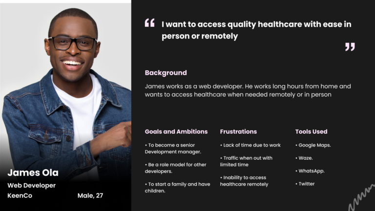
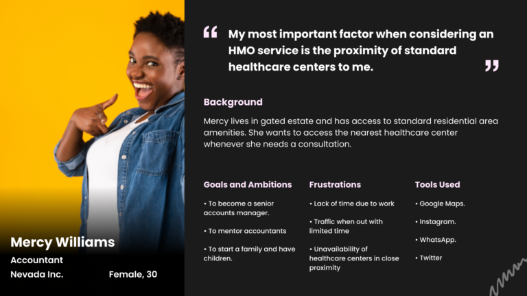
user personas
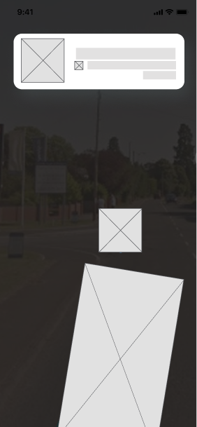
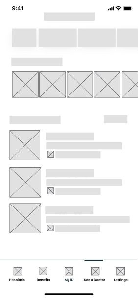
Wireframes
USABILITY STUDY : FINDINGS
I conducted two rounds of usability studies. Findings from the first study helped guide the designs from wireframes to mockups. The second study used a high-fidelity prototype and revealed what aspects of the mockups needed refining.
Round 1 Findings
Round 2 Findings
Users want to have a digital ID in the app
Users want to access healthcare remotely
Users want to see hospitals closest to them
Users want to be verified with digital ID
Users want to start conversation with a doctor in app
Users want direction to closest hospitals
high fidelity designs
The final designs were derived after reviews from the findings. The designs presented are specifically for account and customer support teams.
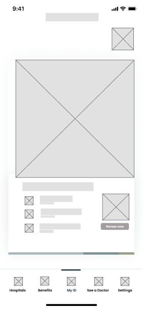
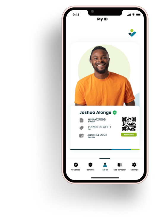
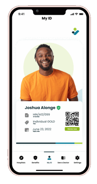
The user ID screen allows users access to a digital HMO ID in the event that they are not with the physical card at the healthcare center. The ID is also scannable by the attendant to get full details of the patient. Other information including plan type, ID number and expiry date are also visible. Users can also click to renew their subscription at anytime.
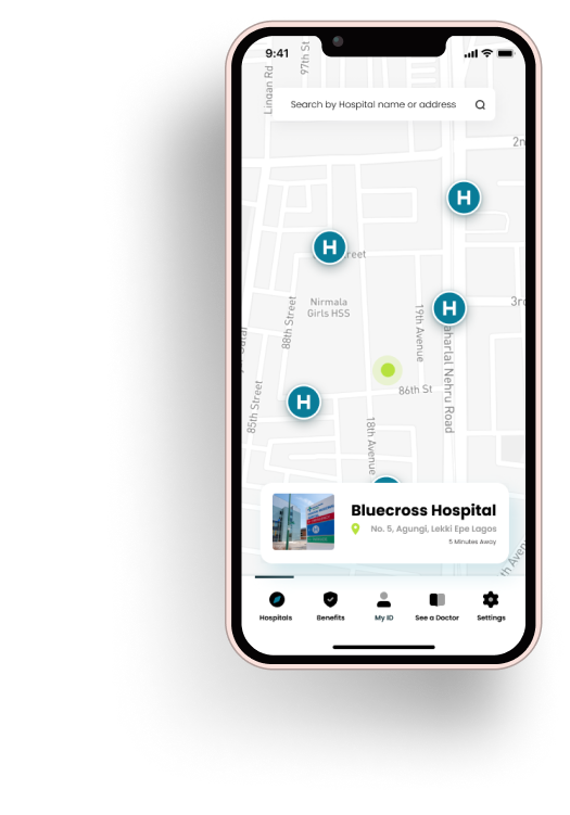
The Hospitals screen shows all the hospitals close by and their respective distance from the user location. User can also click on the “H” icon to get the Hospital details.
The hospitals are displayed based on the user location, hospital availability and plan type.
The Hospitals screen shows all the hospitals close by and their respective distance from the user location. User can also click on the “H” icon to get the Hospital details.
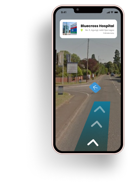
The user can also tap on preferred hospital to get directions using AR to the hospital.
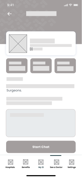
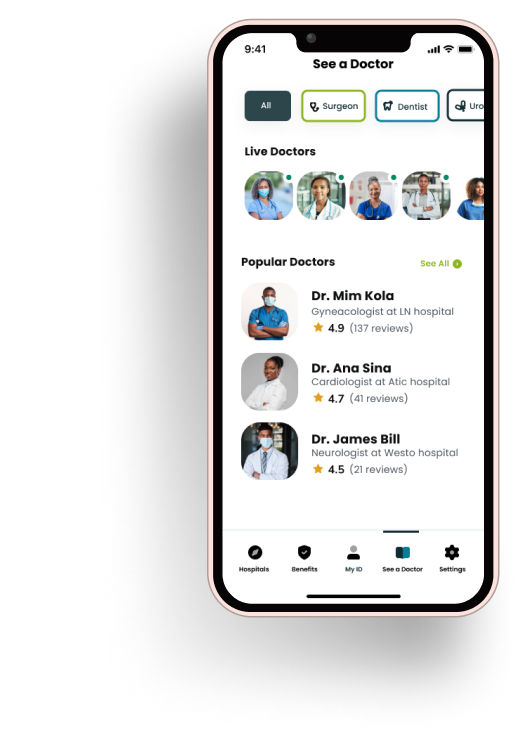
The “See a doctor” screen shows users the available doctors and their online/offline status. The screen provides users with a quick filter to choose the type of doctor they want a consultation with.
The doctors who are online are also highlighted to the user for consultation booking.
Popular doctors and their ratings are also displayed to give users a more filtered option to choose a consultation from.